

Mobile design isn’t just a trend, it’s a necessity. With over 58% of global website traffic coming from mobile devices, businesses that fail to optimize their mobile experience risk losing valuable customers. A well designed mobile site not only enhances user experience but also directly impacts conversion rates, leading to higher engagement and sales.
But how exactly does mobile design influence business conversions? In this article, we’ll explore key strategies to improve mobile design and boost your business’s success.
Why Mobile Design Matters for Conversions
1. Mobile Traffic Dominates
Consumers are increasingly browsing, shopping, and interacting with brands on their smartphones. Studies show that 79% of smartphone users have made a purchase online using their mobile devices. If your website isn’t mobile-friendly, you risk missing out on this massive audience.
2. Google’s Mobile-First Indexing
Google prioritizes mobile-friendly websites in search rankings. This means if your website isn’t optimized for mobile, your SEO rankings will suffer, reducing organic traffic and potential conversions. Use Google’s Mobile-Friendly Test to check your site’s compatibility.
3. User Experience (UX) Directly Affects Sales
A poor mobile experience frustrates users and increases bounce rates. 88% of online consumers say they are less likely to return to a site after a bad experience. A seamless mobile design keeps visitors engaged and encourages them to complete transactions.
Key Strategies to Optimize Mobile Design for Better Conversions
1. Adopt a Mobile-First Design Approach
Instead of designing for desktops first and then scaling down for mobile, start with a mobile-first strategy. This ensures your site is built for the device most users will be using. Keep layouts simple, content concise, and navigation intuitive.
2. Ensure Fast Loading Speeds
Speed is crucial, 53% of users abandon a site if it takes longer than three seconds to load. Optimize your site’s performance by:
- Compressing images using tools like TinyPNG or ImageOptim.
- Using lazy loading to delay the loading of non-essential images.
- Minimizing JavaScript and CSS files.
- Leveraging browser caching to reduce loading time.
3. Simplify Navigation and User Flow
A cluttered mobile interface leads to confusion and drop-offs. Improve navigation by:
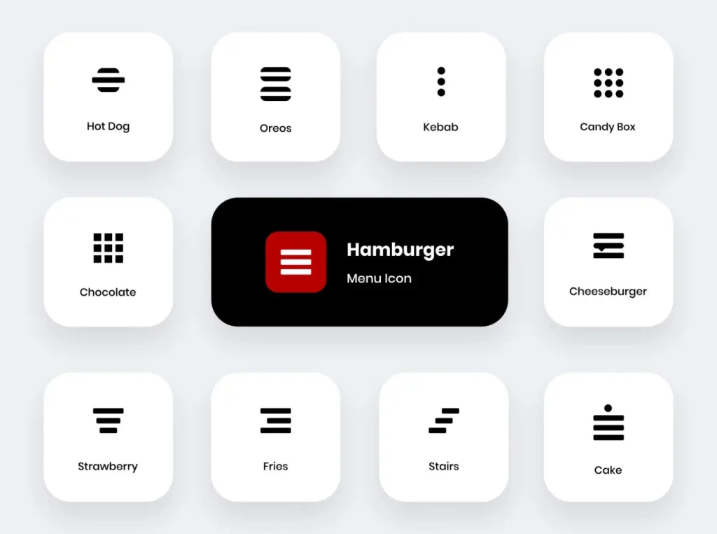
- Using a hamburger menu to keep the design clean.
- Implementing sticky headers for easy access to essential links.
- Providing a search bar to help users find content quickly.
4. Optimize Forms for Mobile Users
Forms are critical for lead generation, but they can be frustrating on mobile. Improve mobile forms by:
- Using auto-fill and auto-correct features.
- Keeping fields to a minimum (e.g., name, email, and message).
- Utilizing tap-friendly buttons and dropdowns.
5. Leverage Mobile-Friendly Call-to-Actions (CTAs)
CTAs should be large, clear, and easily clickable. The best practices include:
- Using high-contrast colors that stand out.
- Placing CTAs above the fold for immediate visibility.
- Ensuring buttons are at least 48px in height for easy tapping.
6. Implement Mobile Payment Solutions
If your business involves transactions, providing seamless mobile payment options is key. Offer:
- One-click checkout options (e.g., Apple Pay, Google Pay, PayPal).
- Guest checkout to avoid unnecessary sign-ups.
- Secure payment gateways to build trust.
7. Use Mobile-Specific SEO Strategies
Since Google prioritizes mobile-friendly sites, consider these SEO strategies:
- Optimize meta titles and descriptions for mobile searches.
- Use structured data to enhance search result visibility.
- Improve local SEO by ensuring your business is listed on Google My Business.
Real World Examples of Successful Mobile Optimization
Example 1: Airbnb’s Mobile-First Strategy
Airbnb focuses on a seamless mobile experience by offering:
- A simple, intuitive search bar for quick property searches.
- Swipe-based navigation for easy browsing.
- Optimized booking forms to reduce drop-offs.
Example 2: Amazon’s One-Click Checkout
Amazon optimizes conversions by:
- Providing a frictionless checkout experience with saved payment details.
- Using personalized recommendations based on browsing history.
- Ensuring a fast-loading, visually appealing mobile app.
Make Mobile Design a Priority
Mobile design is no longer optional, it’s essential for businesses aiming to increase conversions and stay ahead in the digital landscape. By prioritizing a fast, user-friendly, and visually appealing mobile experience, you can improve engagement, reduce bounce rates, and drive more sales.
Ready to Optimize Your Mobile Design?
Start by evaluating your site with Google’s PageSpeed Insights and implement the strategies outlined above. The future of business is mobile, make sure your website is ready to convert visitors into customers.
Related Reads: